

Although we more than halfway into 2016, making sure your website is current is very important. It’s no longer okay just to slap up a website and check it every couple of years. Web design constantly changes and evolves and so should your website. Savvy visitors expect a better user experience that caters to them and this year’s new design trends are offering them that.
With the increased focus on mobile and an enhanced user experience, check that you are offering your visitors accessible, engaging and responsive content–on whatever device they are using. To satisfy their demands and increase their satisfaction, look at these game-changing trends and get on board. See what you can incorporate as soon as possible as web design is moving fast into these new areas.
New Typography
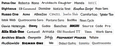 One of the most dominant themes to emerge is beautiful typography. Streamlined interfaces and increased resolutions have allowed creative fonts to emerge. They can create a strong impact in your design. Dominant trends include big and bold. Or use serif and handwriting styles. Lettering can communicate your message is a fresh way. The trick is to be sure it’s readable and that the typography doesn’t fight the design background elements. Also be sure to take into account server speed and load time for people with lower-end mobile devices.
Hint: We recommend exploring Google Fonts where they have hundreds of free open-source fonts that are optimized for online use.
Material Design
Flat design was really hot for a while. Since Google launched its new material design style language, it has become the next big thing. It incorporates more light and shadow as well as the concept of movement. Therefore, it gives flat design much more depth and layering. Material design also allows various image sizes and resolutions to be rendered well. When you incorporate material design into your website, the result is that the designs seem realistic and it’s a richer alternative to flat design.
Hero Images
These striking images grab the users’ attention. Once again, thanks to high-speed Internet connections and video plugins, technological advances have made the way for this popular style to take off. In 2016, you have not only seen this type of bold imagery more often than not, but also you may have already noticed the new trend of hero video headers. These allow for immersive movie-style sites as more video clips and snippets expand into full-fledged, high-definition video experiences.
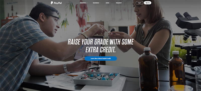
PayPal’s Homepage Hero Image Design
Scrolling
Though a few years back, people thought scroll was dying, smaller screens require users to scroll more. Designers are using more vertical interfaces. And sites with long scroll navigation are trendy now. Storytelling is popular and often in long form. The old way of page by page navigation doesn’t work because users want to control the pacing of their scrolling.
The user experience is paramount these days. With a constant flow of mediocre content and design being presented to your customers, you need to market in a way they desire. Meet them where they are and where they are going.
These are popular tools and techniques for good reason, but don’t just hop on the bandwagon. Think carefully about your targeted demographic and their mission. Then use one or a combination of these four trending elements in your web design to create interactive and engaging websites.
About The Author: Kevin Watts
Kevin Watts is the founder of Raincross, a premier web design, development and digital marketing agency headquartered in Riverside, CA.
Kevin got his start in online marketing and website design by working for some of the most prominent names in online retail. He's most recognized for helping to start e-commerce retailer Organize.com in 1998, and spent 12 years running the company's e-commerce and online marketing operations. He has been recognized and has received several online retail, marketing and merchandising awards throughout his career.
Kevin grew up in Riverside, CA and graduated from the University of Wyoming. In his spare time, Kevin is an avid fly-fisherman, college football fan, and enjoys spending time with his son Matthew, daughter Kate and wife Lindsey.
More posts by Kevin Watts